Exploring Relationships and Testing Hypotheses in CDC Cancer Data
1 Objectives
- To investigate the relationships between:
- Cancer site,
- Patient’s race, age, & sex assigned at birth, and
- The number of patients diagnosed with cancer using descriptive statistics in SPSS.
- Conduct t-tests on comparisons of your choice and reflect on potential confounding variables.
2 Background
The Centers for Disease Control and Prevention monitors the rates of cancers across the US and makes portions of those data available to the public. This activity will use one set of those data to guide you through common steps in exploring data. I have already downloaded a subset of these data and prepared them for you. I have not included the place where the participants live (to reduce the already-large size of the data), so these include the number of people diagnosed with any type of malignant neoplasm at a given body site.
3 Using Excel
- This cancer incidence dataset is an Excel-formatted version of the data.
3.1 Descriptive Statistics
3.1.1 Generate Descriptive Statistics
3.1.1.1 Descriptives of Count
We will use Excel to generate descriptive statistics for the Count variable. This variable represents the number of people diagnosed with cancer at a given site, broken down by race and 10-year age group.
- Open your data in Excel and locate the column labeled
Count. This column contains the number of cancer diagnoses. - Click on the Data tab at the top and then select Data Analysis (if it’s not visible, you may need to enable the “Analysis ToolPak” add-in).
- In the Data Analysis dialog, select Descriptive Statistics and click OK.
- In the Descriptive Statistics dialog box:
- Input the range for the
Countdata. - Select the checkbox for Summary Statistics.
- Choose to display the output in a new worksheet or in the same worksheet.
- Input the range for the
- Click OK to generate the descriptive statistics.
3.1.2 Review the Output
- After clicking OK, Excel will generate a table of descriptive statistics for the
Countvariable. This table will look something like this:
| Statistic | Value |
|---|---|
| Mean | X.XX |
| Standard Deviation | X.XX |
| Median | X.XX |
| Minimum | X.XX |
| Maximum | X.XX |
| Range | X.XX |
| Skewness | X.XX |
| Kurtosis | X.XX |
3.1.3 Interpret the Descriptive Statistics
- The mean gives an idea of the average number of cancer diagnoses.
- If the mean is much higher than the median, it suggests a right-skewed distribution with some high values pulling the mean up.
- The range and standard deviation help in understanding how spread out the data are.
- Skewness and kurtosis provide additional details about the data distribution. A high skew indicates more extreme values on one side, while high kurtosis suggests the presence of outliers.
3.1.4 Confidence Intervals in Excel
To calculate 95% confidence intervals for the Count variable, we need to create our own formula:
Compute the standard error (SE):
\[ SE = \frac{\text{Standard Deviation}}{\sqrt{N}} \] Use the formula in Excel:=STDEV.S(B2:B100)/SQRT(COUNT(B2:B100))Calculate the margin of error for a 95% confidence interval: \[ \text{Margin of Error} = 1.96 \times SE \] Excel formula:
=1.96 * (STDEV.S(B2:B100)/SQRT(COUNT(B2:B100)))Compute the confidence interval bounds:
- Lower Bound:
= AVERAGE(B2:B100) - Margin_of_Error - Upper Bound:
= AVERAGE(B2:B100) + Margin_of_Error
- Lower Bound:
3.1.5 Correlations
- Click on the
Datatab and selectData Analysis. - Choose
Correlationand clickOK. - Select the input range (e.g.,
CountandYearcolumns). - Check
Labels in First Rowif applicable. - Click
OKto generate a correlation matrix.
If the correlation coefficient is close to 1, it indicates a strong positive relationship; if close to -1, it suggests a strong negative relationship.
3.1.6 t-Test
To compare mean cancer counts by sex (female vs. male): 1. Click on Data > Data Analysis. 2. Select t-Test: Two-Sample Assuming Equal Variances (or Unequal Variances if Levene’s test suggests so). 3. For Variable 1 Range, select all values in Count for females. 4. For Variable 2 Range, select all values in Count for males. 5. Enter 0.05 as the significance level (alpha). 6. Click OK.
Excel will output: - t-statistic and p-value (compare with 0.05 for significance) - Mean difference between the two groups
3.2 Descriptives of Two Variables
3.2.1 Using the PivotTable Function in Excel
- Select your data and go to the
Inserttab, then click onPivotTable. - In the
PivotTable Field List, dragCountinto the Values box and set theSummarize byoption toAverage. - Drag any categorical variable (like
Race,Sex, orAge Group) into the Rows box to segment the data by that variable. - To get additional descriptive statistics such as standard deviation, click the drop-down next to
Countin the PivotTable and selectValue Field Settings, then chooseStandard Deviation. - This will generate a table summarizing the average and standard deviation of
Countby the selected categorical variable.
3.2.2 Review the Output
- The PivotTable will show descriptive statistics for
Countsegmented by the chosen categorical variable (e.g.,RaceorSex). - It will display values such as mean, standard deviation, and count, showing the distribution of
Countacross different categories.
3.2.3 Interpret the Output
- Compare the mean and standard deviation for different groups. If there is high variability within a group, the standard deviation will be large.
- Consider skewness for additional insights into the distribution of the data. This can be done through examining a histogram of the data outside of PivotTables.
4 Using SPSS
4.1 Materials Needed
4.2 Steps
4.2.1 Data Preparation
- Please follow these instructions to open SPSS online through Apporto, the method made available to us.
- The data are available as a
.savfile from here. This is SPSS’s native format for a data file. - Load the cancer incidence dataset into SPSS. Note that although I’ve not included all of the possible variables in these data, it’s still a pretty large file—about 4.5 MB and 50k rows—so it may take a couple of seconds to load.
4.2.2 Orientation to SPSS
SPSS is organized into a set of windows with drop-down menus at the top of each. The two windows you will work with most (if not exclusively) are the Data Editor and the Output window.
The Data Editor window shows the actual data. It has two tabs which show the data in two ways:
- The
Data Viewtab shows the data like it would be shown in a spreadsheet program like MS Excel, LO Calc, or Google Sheets. Here, each column is a variable and each row is one instance of data, here a group of people in a given year who are all of the same race and age group. - The
Variable Viewtab instead shows a listing of the variables—not the actual data—and the characteristics of that variable, such as whether it is a “nominal” or “scale” variable. A nominal variable separates people out into groups that only differ by the name they’re given; no one group is “more” than any other. A scale variable assigns a numerical value, like how tall they are or—like here—how many people were diagnosed with a given type off cancer.
More about the SPSS interface can be found here.
4.2.3 Descriptive Statistics
4.2.3.1 Generate Descriptive Statistics
4.2.3.1.1 Descriptives of Count
We will first use SPSS to look at one variable alone, in this case, the number of incidents of cancer per age group. More specifically, the Count variable is the number of people of a given race and in a given 10-year age group who were diagnosed with cancer at a given site.
- In the
Data VieworVariable Viewin SPSS’sData Editorwindow, please locate the variable labeledCount. This variable represents the number of people diagnosed with cancer at the given site (and thus likely the general type of cancer, although there is no indication here that this is the site of origin). - Go to the
Analyzemenu at the top of SPSS and selectDescriptive Statistics. - In the
Descriptivesdialog box, you will see a list of variables. SelectCountand move it into theVariablesbox. - Under
Options,you can choose various statistics you want to compute. Common choices include:- Mean: The average number of cancer diagnoses.
- Median: The middle value in the data, which is less affected by outliers.
- Standard Deviation: A measure of the spread or variability in the data, it’s also the average distance of scores from the mean.
4.2.3.2 Review the Output
After configuring the settings, click
OK. SPSS will generate the descriptive statistics for theCountvariable.The output will include a table with the statistics you selected. It will look something like this:
        Descriptive Statistics
                           Mean     Std. Deviation    Median   Quartiles
        Count              X.XX           X.XX         X.XX    Q1 = X.XX
Again,
Meanprovides the average number of cancer diagnoses.Std. Deviationmeasures the variability in the data.Mediangives the middle value, which can be useful when data is skewed.Quartilesprovide information about the spread of data
4.2.3.3 Interpret the Descriptive Statistics
- The mean, median, and standard deviation help you understand the central tendency and spread of the
Countvariable. - For example, if the mean is significantly higher than the median, it suggests a right-skewed distribution with some high values.
- The quartiles show how the data is distributed within the 25th, 50th (median), and 75th percentiles.
- Consider the values in the context of cancer prevalence—and perhaps in light of, e.g., social inequalities—to draw meaningful conclusions about the distribution of cancer diagnoses.
4.2.4 Decsriptives of Two Variables
4.2.4.1 With the General Explore Function
I believe one reason for SPSS’s popularity is that it can generate a lot of insights with just a few clicks through the graphical user interface (GUI). This is certainly the case with the Explore function:
- From any window in SPSS, click on
Analyze > Descriptive Statistics > Explore - In the dialogue that opens, please put
Countin theDependent List:field. We are assuming thatCountis the outcome variable, that which is being influenced by the other variables. - The
factor List:is where we can put any/all variables that we want to see if they affectCount1. For now, let’s include all of them exceptCancer Site:
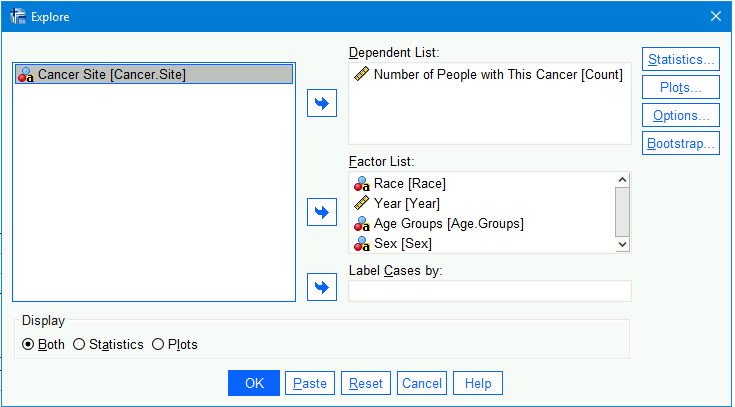
- After clicking on the
Statisticsbutton, please choose to includeDescriptives(and leave theConfidence interval to Meanto be95%). Then please clickContinueto go back to the mainExploredialogue. - It will produce perhaps too much output, but let’s nonetheless make to include the
DisplayofBothstatistics and plots from the bottom of the window. - And then click
OK
There are several types of outputs here2. You will notice in the navigation menu to the left that the output is organized by factor variable. Let us go through this output, focusing on Race (if Race isn’t the first one for you, simply use that menu to click on that section of the output.)
4.2.4.1.1 Case Processing Summary
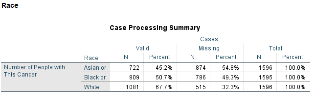
This table summarizes the number of cases (rows) of data that were processed by the Explore function. This is useful for not only seeing how many cases they are, but how many missing values there are, too.
There are in fact many missing rows. Well, in fact, these are rows with missing Count data; there are no other missing values. And these aren’t actually missing: There were simply too few people with a given type of cancer that—when also knowing their race, age, year, etc.—it would be conceivable to figure out who that person was. In these cases, the CDC removed that data from this set.
Removing data like this (that was specific enough to person compromise the person’s anonymity) is called “truncating the data. Truncated data has values removed if they meet certain criteria. Here, that criterion is when there are only a few cases (but not zero), again to help preserve people’s confidentiality.
4.2.4.1.2 Crosstable of Count by Race, Sex, Age Group, and Year
The piece of output is a monstrous and confusing table that gives the number of rows that have a certain Count value. In other words, we can see from the upper-most part of this table that the average number of Asians (or Pacific Islanders) suffering from cancer at any site (and in people of any age group) is 11.20:
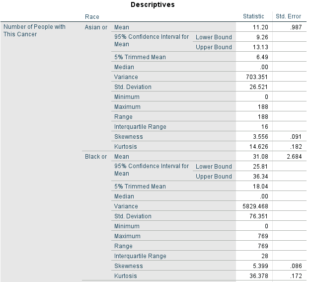
This table also shows:
- The 95% confidence interval for that mean of 11.20, which is
9.26–13.13.
What this means is that, although we got 11.20 for the mean number of Asians in a given age group suffering from cancer, we know that our measurements might not be perfect. Based on the spread (theVariance) of these data, we are 95% confident that the true number of cancers here is somewhere between 9.26 and 13.13. In other words, although the sample mean was 11.20, we are 95% sure that the population mean is actually some value between 9.29 and 13.13.- The
Std. Errorcolumn to the right of the table presents the standard errors for the given statistic. A standard error is used (among other things) to compute a 95% confidence interval around a statistic.
- The
- The
5% Trimmed Mean, which is6.49.
A “trimmed” mean has some number of values removed from both ends of a sample. Here, SPSS removed 5% of the sample data (2.5% from each end). Why do this? To reduce/investigate the effect of extreme values, i.e., times when very many and very few Asians of a given age group had cancer. This reduces the influence of outliers.
Here, the trimmed mean of 6.49 is quite different than the untrimmed mean of 11.20. Since the trimmed mean is lower, this indicates that there are indeed some extreme values that would otherwise pull the (untrimmed) mean up to a higher value. (If the trimmed mean were higher than the untrimmed, this would indicate that extreme values were pulling the untrimmed mean down.) Median, which is the middle value.
Here, the median is zero, indicating that for any given age group, Asians usually did not present with cancer. This is interesting given that the trimmed mean pulled the mean downwards. Together, these suggests that there are a few categories in which Asians have a lot of cancer diagnoses, but that otherwise they don’t; the data forCountis surely not normally distributed.VarianceandStd Deviation(standard deviation) are both measures of how spread out the values are.
The variance is simply the square of the standard deviation (i.e., 26.521² = 703.351).
The standard deviation is (always) presented in the same units as the mean. The standard deviation can be seen as the average distance from the mean for any givenCount. Here, it is 26.5, which is larger than the mean (\(\overline{x}\) = 11.2). This indicates that the data are very spread out, and that the mean doesn’t really tell us much about any one given race / age group slice of theCounts, at least among the Asian participants.- The
Minmum,Maximum, andRangevalues are straight forward. The maximum of188gives further indication of the spread of values. Interquartile Rangeindicates the number of values in each fourth of the data.SkewnessandKurtosisdenote the extents to which the data are asymmetrical and have long tails / significant outliers, respectively.
Of these, only skewness is of any real value, and even here, I suggest looking at distributions of the data instead of trying to discern what the number means. Nonetheless, to review what these values mean:- Skewness
- Negative skewness indicates a longer tail extending down into smaller values
- Positive skewness denotes a longer tail extending hot into larger values
- The skewness here is ``
- Kurtosis
- A kurtosis of 0 denotes a normal distribution3.
- Values less than 3 mean the tails are short, and that there are thus few outliers
- Values grater than 3 indicate longer tails
- For both skewness & kurtosis (as presented here), values greater than ± 2 are usually considered appreciably non-normal.
- The skew is
3.556, which is positive and greater than 2, indicating a positive skew (there are more large values than we’d expect for a normal distribution). - The kurtosis is
14.626, also indicating more spread—longer tails—than we’d expect. Given the skew, we know that it’s the right tail—the one extending up into higher values—that’s longer than it should be.
- The skew is
- Skewness
This table isn’t very helpful here, but it does serve to show what a cross table is. It’s a table that shows the number of participants/rows broken down by other variables.
Of course, we could have chosen fewer factors and produced a more sensible table here. Throwing everything in does produce some more useful output lower down.
4.2.4.1.3 Stem-and-Leaf Plots
Stem-and-leaf plots are less common than they used to be. (They’re easier to produce with pen and paper than a lot of other figures.) They’re still useful, though, and I’m glad SPSS includes them by default.
However, SPSS doesn’t always present them in the best way. Given that, it may be better to explain them with an other example. Imagine these are the data we have measuring, say, Hb A1c levels among patients with more-or-less controlled diabetes:
| Patient ID | A1c |
|---|---|
| 1 | 5.1 |
| 2 | 5.6 |
| 3 | 6.2 |
| 4 | 6.2 |
| 5 | 6.8 |
| 6 | 6.9 |
| 7 | 7.3 |
| 8 | 7.4 |
| 9 | 9.8 |
| 10 | 10.2 |
These values have been order from lowest to highest, but even then it’s not so easy to tell how they are distributed. We can make these A1c levels into a stem-and-leaf plot to look at that. In a stem-and-leaf plot, we take, say, the values to the left of the decimal to be our “stems” and then add as many “leaves” of the values to the right of the decimal as we have in the data:
5 . 16
6 . 2289
7 . 34
9 . 8
10 . 2
- There is a 5.1 and a 5.6 in these data, so we make a “stem” of 5 and then add “leaves” for the 1 and 6 after the decimal.
- There are two 6.2s, so we add two 2 “leaves” after the 6 “stem” in the plot.
- There were no values that had an 8 to the left of the decimal, so we leave that row blank.
In the example above, the “stems” are values to the left of the decimal, but we could use other numbers for the stems, such as 10s:
| Patient ID | Heart Rate (beats per minute) |
|---|---|
| 1 | 55 |
| 2 | 60 |
| 3 | 60 |
| 4 | 61 |
| 5 | 62 |
| 6 | 67 |
| 7 | 68 |
| 8 | 70 |
| 9 | 76 |
| 10 | 84 |
5 . 5
6 . 00178
7 . 01
8 . 4
That’s a lot of people with heart rates in the 60s, so we could also add an other column in front of each row noting how many cases are in each row:
Freq. Stem Leaf
1 5 . 5
6 6 . 001278
2 7 . 06
1 8 . 4
We could even break stems into multiple rows if there are a lot of leaves. There aren’t that many leaves here, but to show an example of doing this by dividing each relevant stem in half:
Freq. Stem Leaf
1 5 . 5
4 6 . 0012
2 6 . 78
1 7 . 0
1 7 . 6
1 8 . 4
Looking now at the stem-and-leaf plot in the SPSS output, we see that there are other ways of presenting these plots—but that still follow the same, general strategy:
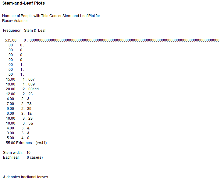
Counts of Cancers for Asians of a given Age GroupTo understand how SPSS made this a bit differently, first look at the explanation below the plot, which says that the Stem width is 10 and that Each leaf is actually 6 cases (so there should in fact be six times as many leaves as is shown). The description also says that & denotes fractional leaves, so the &s in the plot show fewer than 6 cases.
SPSS also divided the rows so that there are more than one row for the teens, more than one for the twenties, etc.
It also divided the zeros into multiple rows. the first “zero” row has 535 zeros and the other ones have no values. Silly computer.
To understand this table a little better, let’s focus on the first few twenties rows:
28.00 2 . 00111
12.00 2 . 23
4.00 2 . &
- The rows were divided into “bins” of two numbers, so the first rows of twenties is counting the number of times
Countwas 20 or 21 for Asians.- There are two 0s, so there were (about) 2 \(\times\) 6 = 12 times that the
Countwas 20 for Asians. - There are three 1s, so there were about 3 \(\times\) 6 = 18 times that
Countwas 21. - The
Frequencyfor that row was actually 28, so it was indeed about 12 and 18 of those values. (And no, I don’t know when SPSS chooses to use&and not here since this is a fractional amount.)
- There are two 0s, so there were (about) 2 \(\times\) 6 = 12 times that the
- The next twenties row indicates that there was about six 22s and about six 23s.
TheFrequencyis 12, so there may well have been exactly 6 of each. - The next row indicates that there were four values of either 24 or 25.
- Since there are only four, SPSS noted this is a fraction of 6 with that
&. We know that these four values were either 24s or 25s because wen can infer from the rest of the table that each stem is for two values.
- Since there are only four, SPSS noted this is a fraction of 6 with that
So, unlike the simple example I used to introduce these plots, this one has “stems” that are not the number to the left of a decimal,
4.2.4.1.4 Boxplot
The next figure, under the Boxplot listing in the menu, is in fact a box-and-whisker plot, although it’s less to tell from this figure:
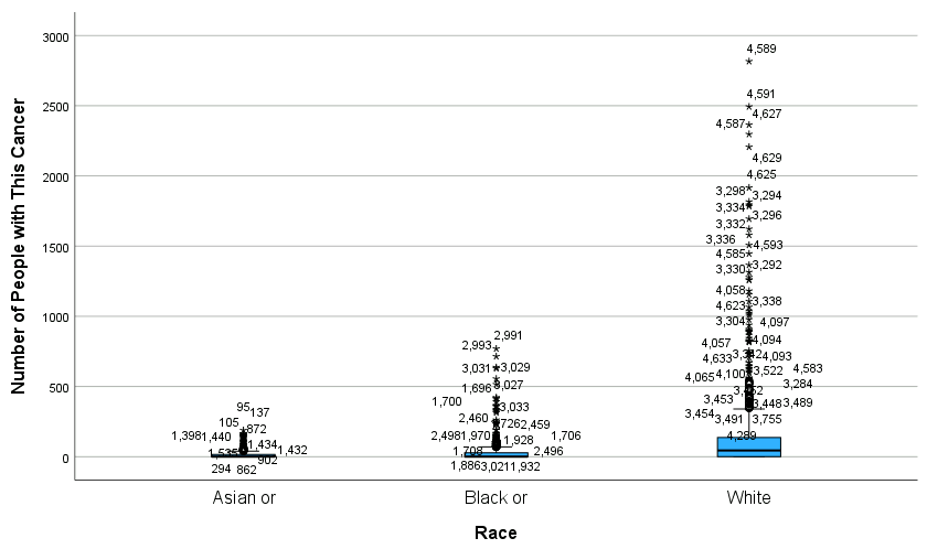
Counts by RaceLooking at the category for Whites, we can just barely see the “box” at the bottom in blue. The thick line in the middle of that box is the mean. The blue area above the mean is the 25% of cases above the mean; the thinner blue area below the mean is the 25% just below the mean.
Although hard to see, there is a T above the blue box that shows the range of the next 25% of values (i.e., those Race and Age Groups with Count values that were 75 – about 100% above the mean).
The rest of the values extending up are outliers. (Which is why I said that the T represented up to “about” 100%; it doesn’t include all of these outliers.)
This figure thus indicates that there was more variations in the numbers of Whites being diagnosed with cancer than either Asians or even Blacks. An important caveat, though, was hinted to in the Case Processing Summary table which showed that were somewhat more Whites (n = 1081) than Asians (n = 722) or Blacks (n = 809). Nonetheless, the range of values in that box-and-whisker plot appears to represent a greater range and the differences in numbers of Asians, Blacks, and Whites would suggest.
4.2.5 Correlations
- In SPSS, use the
Analyze > Correlate > Bivariate...to run correlation analyses. - Under the
Correlation Coefficientsmake surePearson—for Pearson’s r—is selected. It is the correct choice for two, scalar variables.Kendall's tau-bis used for ranked data, i.e., when we can rank participants on each variable, but don’t know the absolute values.Spearmanis for Spearman’s ρ (“rho”), which also looks at ranks, but really is used as a more robust option than Pearson’s r. So, one may use Spearman’s ρ for data that are not normally distributed or when the two variables being correlated are not linearly related
- Calculate correlations between
CountandYear, the only other scalar (i.e., continuous) variable here. - This is admittedly not that interesting, Nonetheless, please interpret the correlation coefficients and significance levels. Remember that a correlation is considered significant is the p-value (
Sig. (2-tailed)value) is less than .05, meaning we should have less than a 5% of being wrong in assuming that there is indeed a relationship between those two variables.
4.2.6 t-Test
Let us now conduct a t-test. A t-test compares the means of two groups4. Here, Year and Sex each contains two groups (2019 vs. 2020 and female vs. male), so we can use a t-test to see if, e.g., females tend to have higher numbers of cancers (of any type and in any age group) than males5.
4.2.6.1 Conducting a t-Test
To conduct a t-test investigating whether females have a different mean number of cancer diagnoses than males:
- Click on
Analyze > Compare Means and Proportions > Independent-Samples T Test... - Add
Countto theTest Variables(s):field andSexto theGrouping Variable:field:
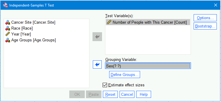
- Click on the
Define Groups...button. In the new dialogue that opens, typeFemalein theGroup 1field andMalein theGroup 2field.6 - Under
Options, make sure thatExclude cases analysis by analysisis selected. (This doesn’t do anything here since we’re only doing one analysis, but it’s a good habit to remember to change away from SPSS’s typical default of excluding cases listwise. Listwise removal is almost never justified; pairwise removal (or analysis-by-analysis) is almost always better.)
4.2.6.2 Output
The output includes two tables:
4.2.6.2.1 Group Statistics
The Group Statistics table simply gives some descriptive statistics for the females and males:

Group Statistics Table for Females and MalesThe N, mean, and standard deviation you (should by now) know. The standard error of the mean (SEM, here listed as Std. Error Mean) is a measure of accuracy of the measurement of the means; a smaller SEM indicates that we are more sure that the values we got for the sample means (here 66.52 and 70.09) are close to the actual, population means7. These SEMs are pretty small relative to the values of the means themselves, so we are pretty confident that these sample means are good estimates of the population means. The mean for the females is slightly more reliable than that of the males; this is because there is more variance among the male counts of cancer, making us a little less sure exactly where the actual, population value is.
4.2.6.2.2 Main t-Test Output Table
The table called the Independent Samples Test presents the main results of the analysis. (If we had conducted a different type of t-test, this table would have a different name.)
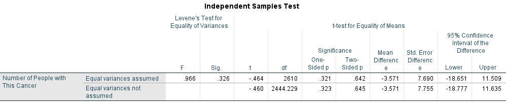
The contents of this table are:
FandSig, listed underLevene's Test for Equality of Variances
This is a test of whether the variances (or standard deviations8) are the same for the females and males. We saw in theGroup Statisticstable above that they are different (SDFemales = 181.351, SDMales = 211.584), but this is now testing if they are significantly different. TheSig.column’s value is greater than .05 (the typical value set for α, the probability of a false positive error), so we can conclude that the variances for the females and males is not different enough to matter.
Matter how? Well, the t-test combines the values for the standard deviations for the groups9, so if one of standard deviations was a lot larger than the other, the t-test would be relying on that variance in the more-varied group too much and the test would be less reliable. How less reliable? Frankly, not much unless the standard deviations are really different. So, yeah, this test is good to look at, but not much to worry about unless it’s extreme. The main effect it has here is which row of this we should use, as I’ll explain next.- Under
t-test for Equality of Means, we first seetanddf. This is the actual value of the t-test that is used to see if the difference is significant as well as the degrees of freedom that’s also used in that test.
Note, though, that there are two rows, anEqual variances assumedrow and anEqual variances not assumedrow. You’ve probably surmised that these correspond to theLevene's Test for Equality of Variances, and you’re right: The top row is best used if Levene’s test did not find that the variances were significantly different (as was the case here) while the lower is best used if that test found a significant difference.
We will use the top row, thus reporting that t = -.464, df = 261010 - The two
Signifiancecolumns provide the p-values; which to use depends:- If we were testing whether one mean is larger than the other, then we would use the value in the
One-Sided pcolumn. We could, e.g., test is females had lower numbers of cancer diagnoses than males. - If we were testing whether the two means are simply different—regardless of which was larger—then we would use the value in the
Two-Sided pcolumn. We would be testing whether females had different numbers of cancer diagnoses than males, whether or not females had more or fewer diagnoses. - Note that the p-value for the two-sided test is simply twice the value for the one-sided test. That is always the case, and shows that more precise tests (i.e., a one-sided test asking a more specific question) require higher levels of evidence.
But here, neither is significant11: Both ps are greater than .05. We could write this as, e.g.:
“Females of any race or age tended to have fewer cancer diagnoses of any type (\(\overline{x}\) = 66.5, SD = 181.3) than did males (\(\overline{x}\) = 70.1, SD = 211.6), However, this difference was not significant (t = -.464, df = 2610, p = .321).”
- If we were testing whether one mean is larger than the other, then we would use the value in the
- The
Mean Differenceis simply the difference between the meanCountsfor females and males (66.52 - 70.09 = -3.571)- The
Std. Error Differenceis the standard error of the difference in means. Just like we can have a standard error for a mean (e.g., what is 4.887 in theGroup Statisticstable for the female mean), so can we have standard errors for other statistics, including for mean differences. This thus represents how confident we are that this difference in sample means reflects the actual difference in the population means. - The last two columns—the
LowerandUppervalues listed under95% Confidence Interval of the Difference—give the range of differences between these two means between which the actual, population mean difference is probably to be found. More simply, although we found a mean difference of -3.57, we are 95% sure that the actual mean difference is anywhere between -18.65 and 11.51. This range of mean differences (-18.65 to 11.51) overlaps zero, so we cannot be 95% sure that the actual mean difference is not zero—an other way of discussing whether it is significant.
- The
4.2.7 Confounding Variables
- The other “deliverable” for this activity is a short document describing what you found. You can use MS Word, LO Writer, Google Docs, etc.
- Please describe what you found in your exploration, in the correlations, and with the t-test. Some guidelines for writing results are here.
- In your writing, please conjecture about why you see some of the relationships that you do.
- Next, please consider how a couple of other variables that were not included in these data (such as the US state in which the participants live, comorbidities or life styles) that could affect these relationships. Describe how they may affect the relationships.
- These “other variables” that could influence the relationship between variables being studied but are not included in the analysis are called “confounds” because they may be confusing—confounding—us.
- Something can be considered a possible confound if it would arguably systematically affect the relationship between two (or more) of the variables present in the data. Therefore, a potential confound must not only affect the variables present, but do so in a way that depends on the levels of the variables present, for example affecting those identifying as female differently than those identifying as male, or that affects older patients differently than younger ones.
- Please strive to write clearly, simply, and concisely.
- And let me know any problems or questions you have.
Thanks!
Footnotes
The word “factor” has several meaning in statistics, and sometimes it’s hard to tell which definition is being referred to. Here, it means that these are the variables we will divide
Countup by, for example looking the theCounts for women versus men.↩︎The Warnings at the top are harmless here: They simply note that the names for the levels of some of the variables is too long to print. You’ll notice lower down, for example, that “Asian or Pacific Islander” has been abbreviated to just “Asian or”↩︎
Sometimes, one will present a value for kurtosis where 3 denotes normality. But, the version given by SPSS, called “Fisher’s definition” of kurtosis, is instead set so that zero denotes a normally-distributed tails.↩︎
There are in fact three comparisons a t-test can analyze:
1. Whether the means of two different groups are different (an “unpaired” t-test),
2. Whether the mean of one group is different at two different points in time (a “paired” t-test, or what SPSS calls an “independent-samples” t-test),
3. Whether the mean of one group is different than some value, usually if the mean is different than zero (a “one-sample” t-test).↩︎If we wanted to test for mean differences in, say,
Cancer Site, which has more than two groups, then we could use an F-test, which is what one does in an ANOVA.↩︎It doesn’t matter here which value for
Sexwe add to which group field. If we were testing, say, if females had more cancer diagnoses than males—not just if they had a different number—then it would matter; the first group being the comparison one.↩︎Standard errors of means (SEMs) are computed by dividing the standard deviation by the same size, viz., \(\text{SEM} = \frac{\text{Standard Deviation}}{\sqrt{N}}\). So, SEMs tend to be larger when the standard deviation is larger; SEMs tend to be smaller with larger sample sizes.
SEMs are also what are (usually) used to compute 95% confidence intervals. The formula for a 95% confidence interval is 95% CI = 1.96 \(\times\) SEM.↩︎Remember that standard deviation is just the square root of the variance.↩︎
The actual formula for this type of t-test here is \(t = \frac{\overline{X}_{Female} - \overline{X}_{Male}}{\sqrt{\frac{SD_{Female}^{2}}{N_{Female}} + \frac{SD_{Male}^{2}}{N_{Male}}}}\).↩︎
The t-value is negative simply because the female mean was lower than the male mean, and we had set up
Group 1to be the females. If we had made males group 1, then this value would be positive.↩︎A t- or F- value that is less than 1 is never significant. Here, the t is -.464, which is less than 1, so we can be sure it won’t be significant. In fact, I could change what I wrote as a way to report this to instead be, “… this difference was not significant (t < 1, …”↩︎